Helping homeowners rent out unused space
Neighbor.com
- Marketplace
- Early stage
- Management
- B2C
- Research
- Strategy
- Visual design
- Prototyping
- Design systems
Summary
Neighbor is a p2p storage marketplace. As the first designer, I helped take the product from 0.5 to 1.0. This included a complete revamp of the 25-step process to list a new property on the app, explained it detail below. It included discovery, prototyping, and a final A/B test. During my time there, Neighbor raised a $53M Series B.
My role
First and solo designer: discovery, design, prototyping, evaluation
Timeline
Oct 2020–Mar 2021
Context
The listing creation flow is the process through which a “host” (someone who has extra space to rent out for storage) posts their space to Neighbor. It consists of around 25 questions we use to create their host profile, their listing, and get them in touch with renters.
It is the primary driver for host education and for determining which hosts will be most successful (based on their engagement and willingness to create a high quality listing). It also drives several top-level business metrics, such as average listing quality, Customer Acquisition Cost (CaC), and listings published per week.
User Goals
- Ultimate goal: make passive income by renting out space on Neighbor
- Quickly list a space on Neighbor
- Confidently gain an understanding of the Neighbor listing and reservation process
Business Goals
- Consistency across all platforms (web, iOS, Android) for simpler analytics and tracking, more straightforward customer support, and consistent design (measured qualitatively by the any necessary differences in design).
- Intentional friction to whisk hosts through the flow during the easy parts, but slow them down and invite thoughtful decision making at the hard parts (measured primarily by listing quality, secondarily by time to complete each step of the funnel)
- Improve listing quality (a compiled metrics based on various properties of a Neighbor “listing”) to elevate overall marketplace quality and decrease negative interactions (measured by a custom internal metric).
Discovery (of the existing flow)
As a new employee, I came in with a completely blank slate about this part of our product. I needed to know what was working, what wasn’t, and where we could improve.
Keep in mind I was one designer trying to keep about 12 engineers moving, so some research was cut short (just a few interviews at a time) to keep things nimble.
Auditing the existing experience
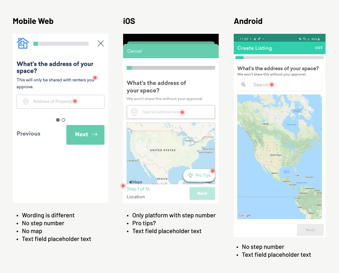
Cross-platform inconsistencies: Each platform (web, iOS, Android) had been developed months apart by different teams. Consequently, there were numerous differences that made it hard for team members to remember how the flow worked on different devices (and hard to diagnose problems from a product perspective). I took note of each difference (so imagine something like this across 25 screens).
{: .image-container }
Reviewing the sequence: each platform presented the questions in the a different order, and there was no consensus as to which order was better or why they were different.
Consolidation patterns: each platform had unique ways of handling data input. I observed a fair amount of confusion (see the session recording section) and used uniformed input patterns in my designs.
User interviews
I interviewed two people just to broaden my perspective: one existing host, and someone who had never heard of Neighbor (someone who lives on my street).
It became pretty clearly there were opportunities to build trust and transparency:
I’m really curious about the pricing model. I have no idea how that’s calculated or why that’s a good price, or if I’m totally getting steamrolled. I put a lot of faith that that’s a good price!
When I first heard about neighbor, it seemed like a way to smuggle contraband, have all these substances in his house. Would the renter possibly send over a gang member? Am I involved in a drug thing?
(This because for the foundation of another project around building trust with hosts. While not included here, ask me about it if you’d like to learn more)
User flow analysis
I didn’t have context for the various historical decisions behind the existing state of the flow, so I created a universal flow I could annotate as I learned new information. I held several feedback sessions with various stakeholders (marketing, customer success, engineering) who held most of the tribal knowledge around previous decisions.
(This image looks small, but this thing is pretty big).
{: .image-container }

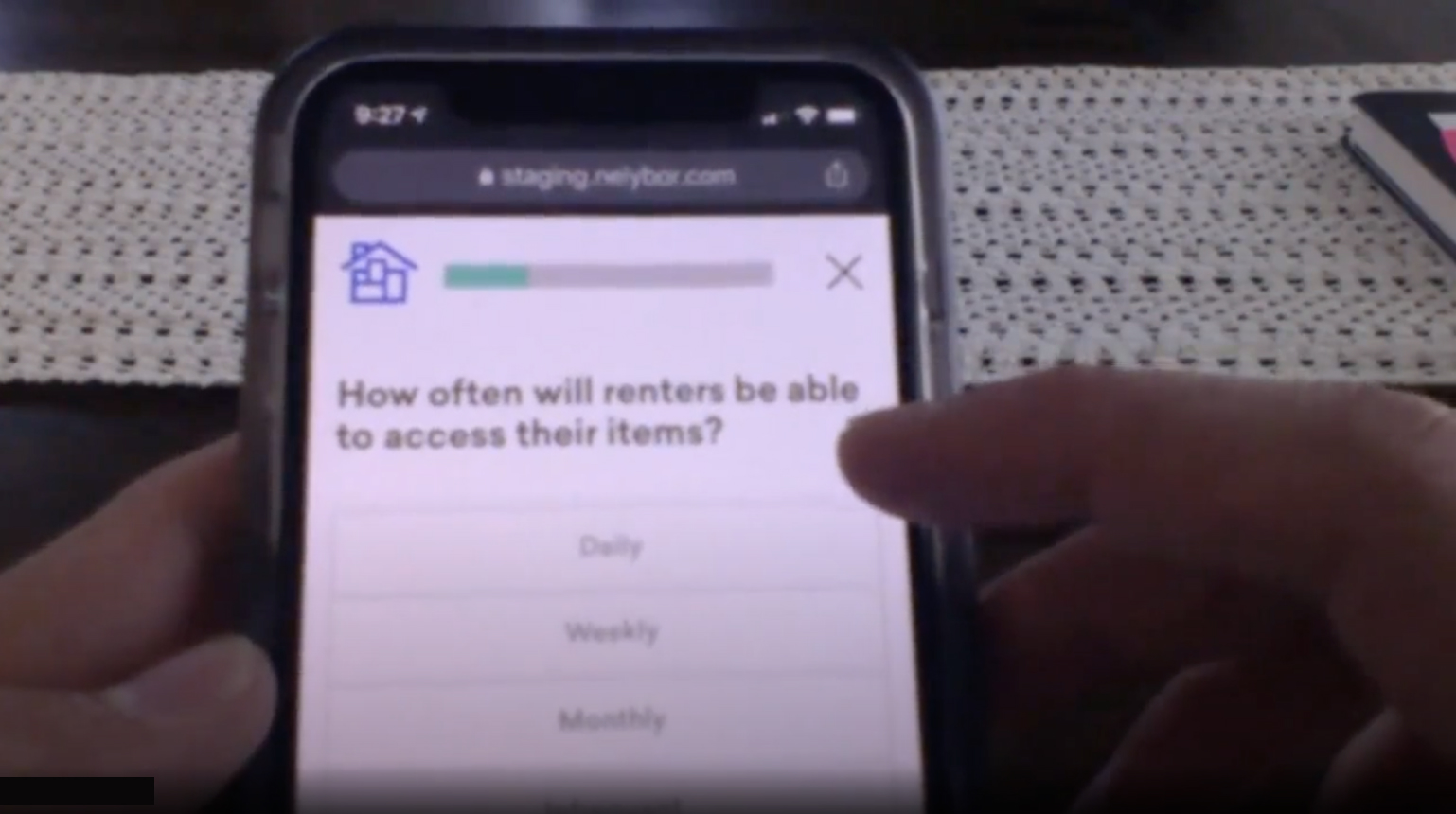
Usability testing
I recruited a few different participants and observed them going through the flow. Took lots of notes, and marked action items and patterns.
(Sorry for the blurry picture. To see the participant’s phone in the early days of COVID, I had them tilt their laptop lid downward for me. Gotta get creative sometimes!)
{: .image-container }
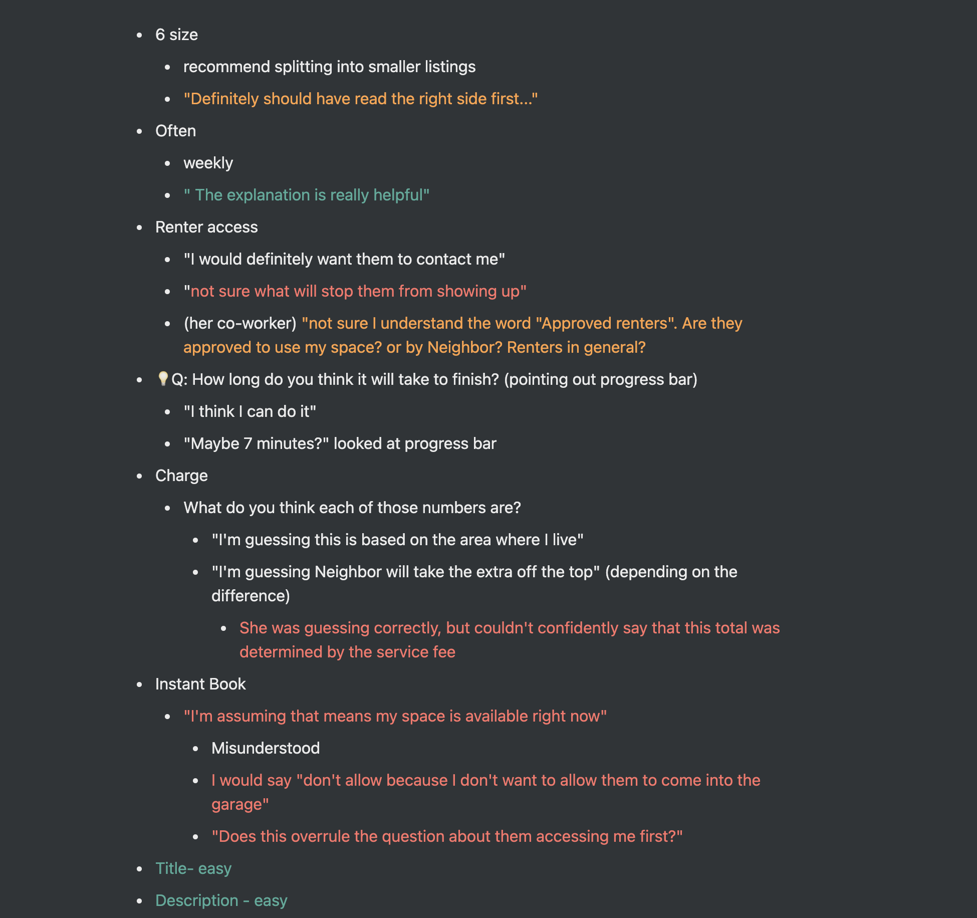
Here are some samples of feedback during the tests:
Not sure I understand the word “Approved renters”. Are they approved to use my space? or by Neighbor? Renters in general?
Definitely should have read the right side first…
I wish I would have known this before I did it, but nice to know I did it right.
I like that it said verified in the top right corner, so I know it worked
I will usually have a third party take notes during the sessions, or transcribe them myself if I’m able to record them. I like the mark things green, yellow, and red for positive, concerning, and negative feedback.
{: .image-container }
Session recording analysis
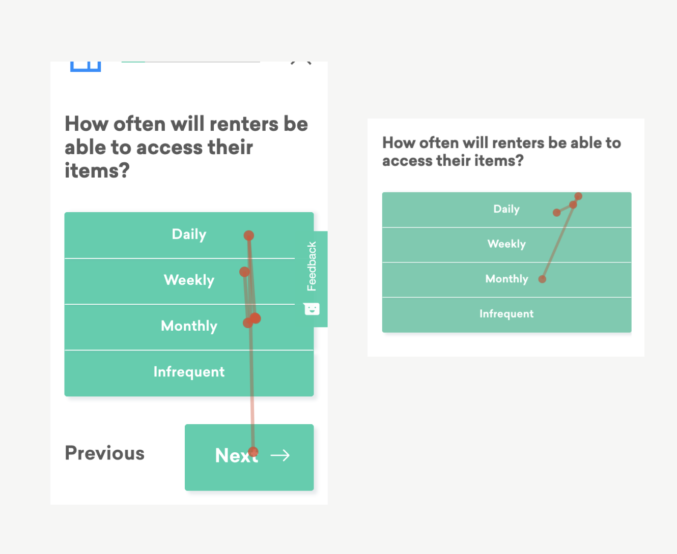
To add to my growing understanding of the flow, I watched dozens of hosts go through the flow with a session recording tool (Hotjar). I saw plenty of hosts get stuck, waffle between options, or drop off entirely.
For example: look at how many times these customers tap between these frequency options (made worse by having so many green rectangles):
{: .image-container }
Understanding the current funnel
{: .image-container }
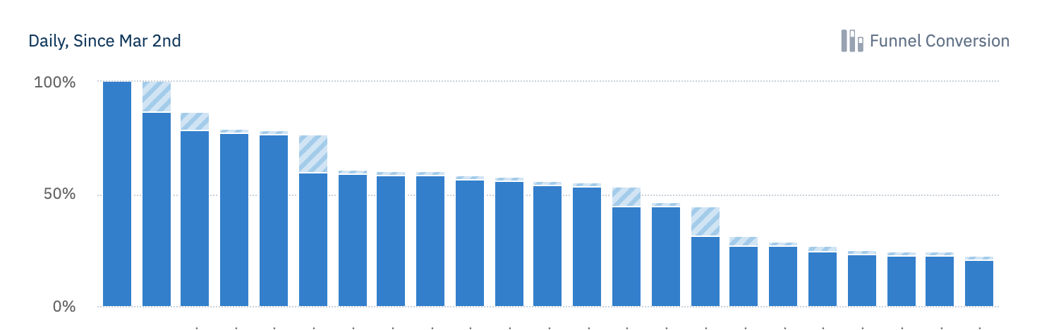
My primary goal in a funnel analysis was to understand the average/median time between each step (to understand where friction might be occurring, or where hosts might need more time to make decisions) and the drop off rate of each step (to find where hosts become intimidated, or where they might be unable to continue—such as not having physical access to their space in the moment).
Key discovery takeaways
- The flow can be steeped in jargon: host, renter, reservation, approval, verification, etc. Providing more education around these terms will help meet our goals of a higher quality marketplace.
- Open-ended questions are paralyzing: Steps that require hosts to generate their own content (profile tagline, listing description, automatic message, etc) almost always have a higher drop off rate than other simple questions.
- Inconsistencies are hurting us: the difference between platforms make it hard for teams to collaborate, for employees to remember the differences (and help customers), and to analyze consistent data between platforms.
- Each step in the flow is its own project: I came away with dozens of notes and ideas about each question in the flow, such as: how to phrase it, what education to provide, which interactions to use, etc. It was like 25 design projects wrapped into one.
UI Design & Iteration
Competitive analysis
Well, not really competitive, but I looked into the guided flows of many other p2p marketplaces like AirBnB, Outdoorsy, Hipcamp, Lyft, Turo, etc. assuming they had already figured a lot of things out. Each company actually approached things fairly differently, but I was able to learn a lot, such as:
- Try to focus on one question at a time, or group related questions
- On open-ended questions, gives examples and templates for success
- Give a consistent and easy way to save progress and come back
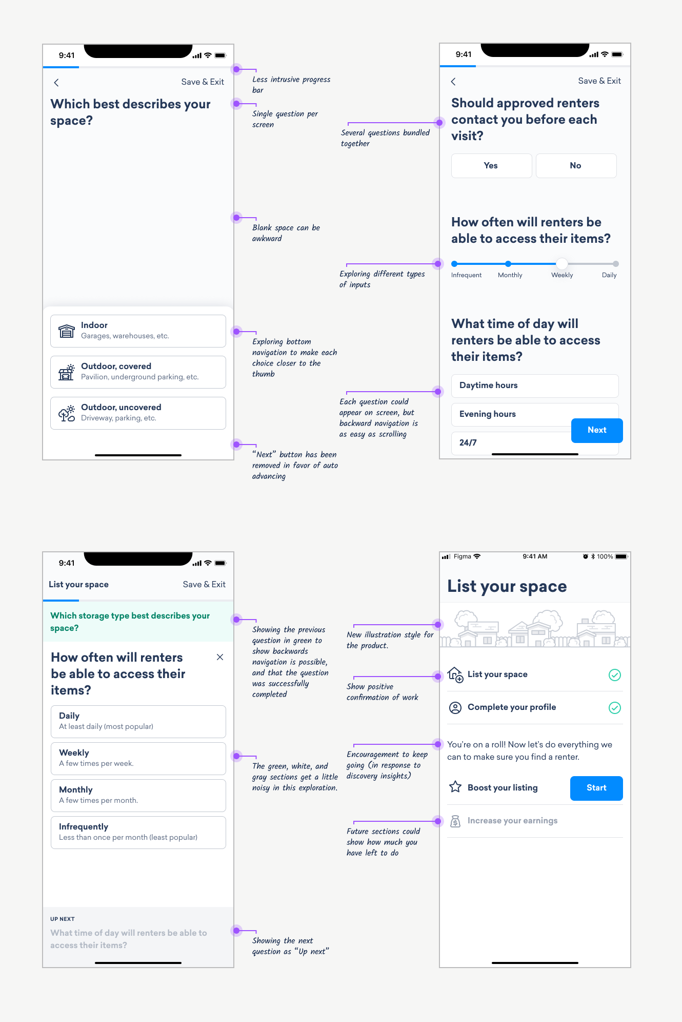
Early design ideas
{: .image-container }
Building trust through design
As noted in user interviews, Neighbor is a relatively new service without as strong of a reputation as something like AirBnB. It doesn’t feel “normal” yet for people to store things in a basement or garage, so we have to pay extra close attention to any moment where a host might feel hesitation or doubt. Here are some of places we adding specific messaging to address this:
{: .image-container }
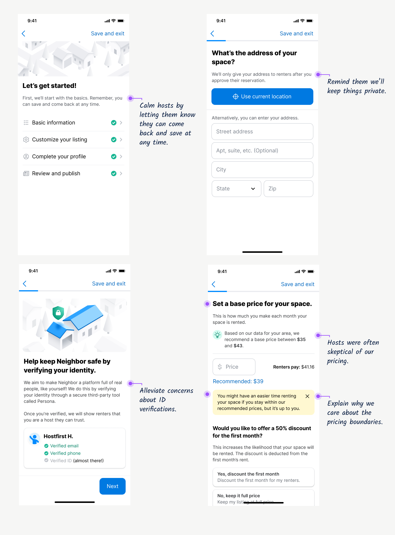
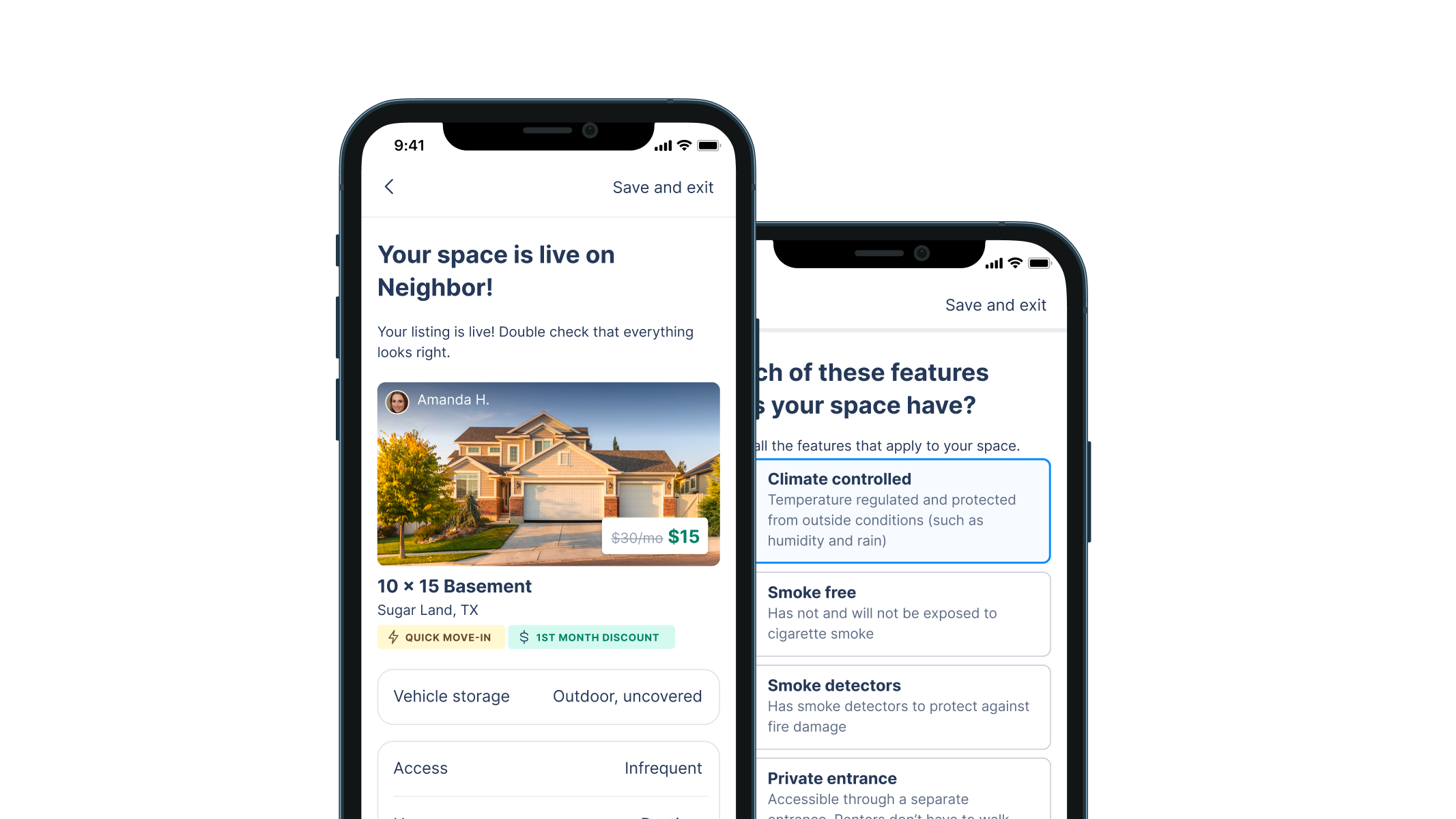
Finalizing design ideas
Here are some examples of the final design decisions applied to our new design system:
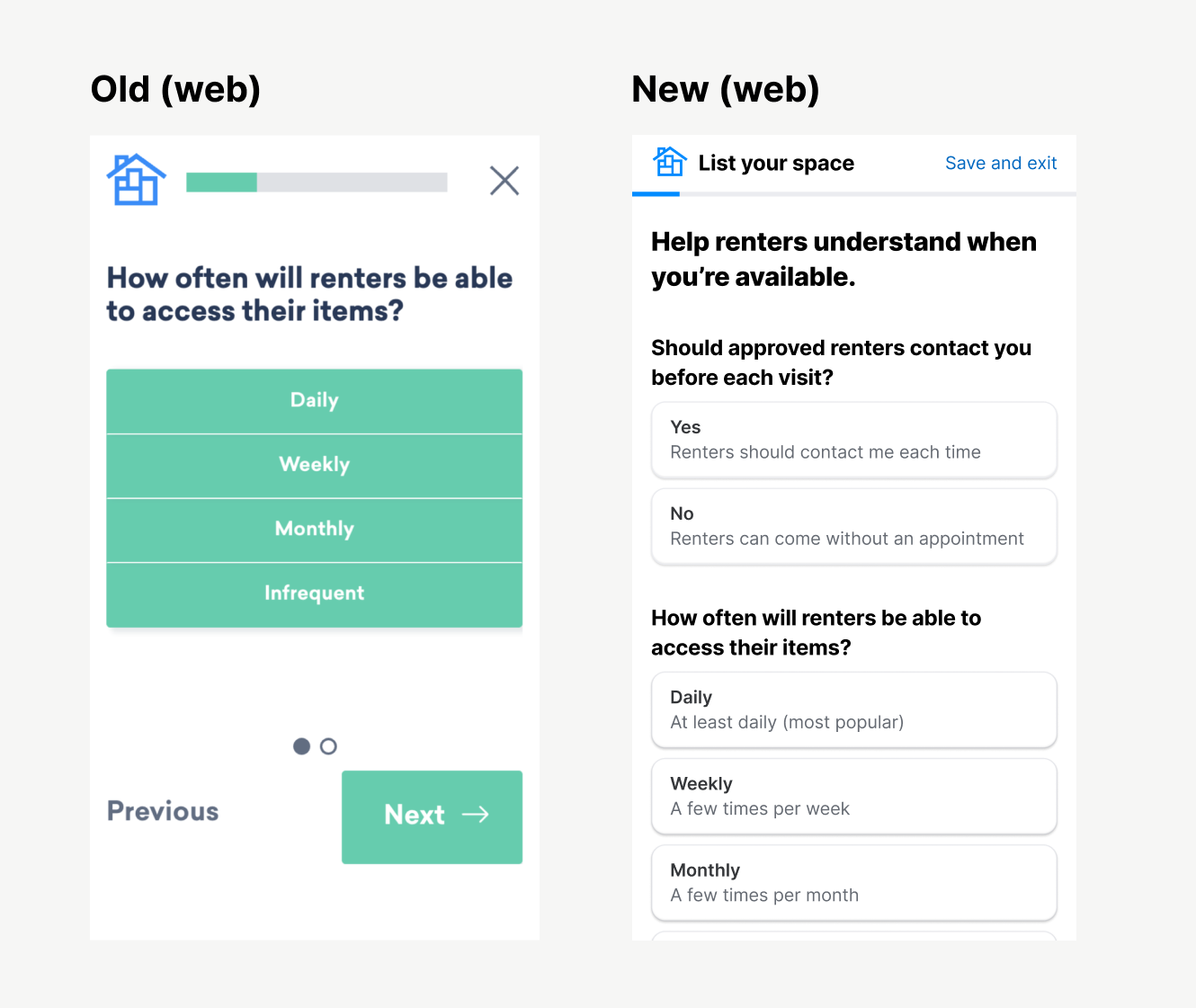
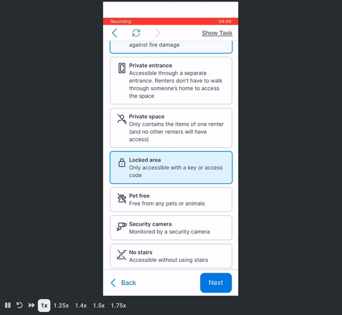
Property access: after seeing confusion in usability tests, we added descriptions to each of the options on this screen.
{: .image-container }
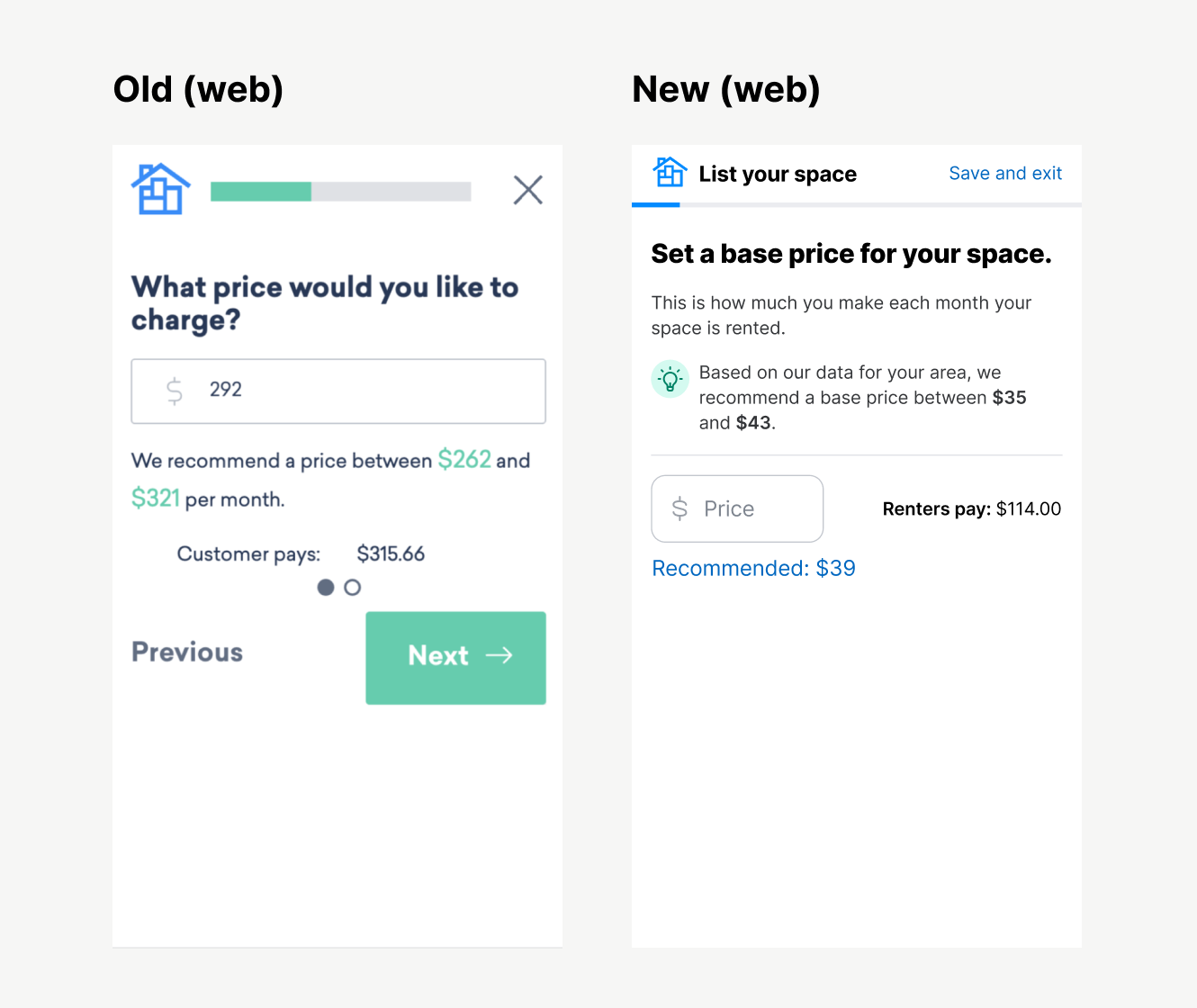
Pricing: many hosts mentioned they doubted how we calculated these price suggestions, and wondering if we were boxing them in to help ourselves (which isn’t possible because we only make money when they do).
{: .image-container }
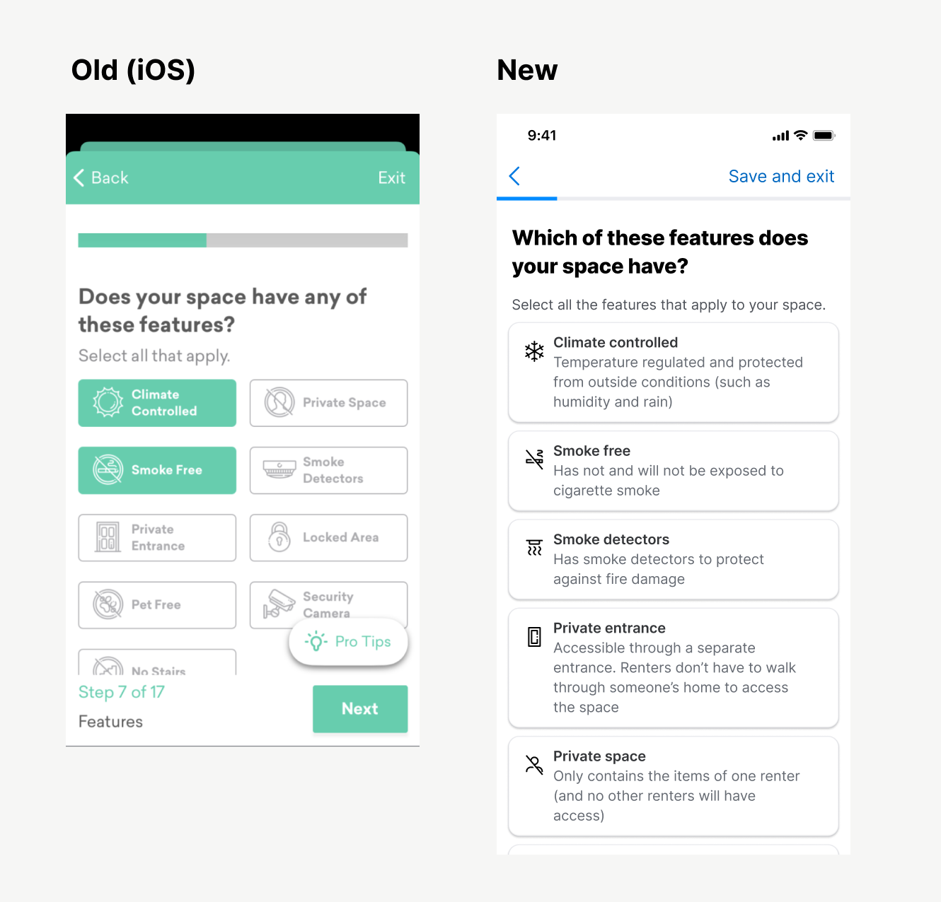
Amenities: Some hosts had questions what each of these amenities meant (and the descriptions weren’t easily discoverable) so we added these descriptions.
{: .image-container }
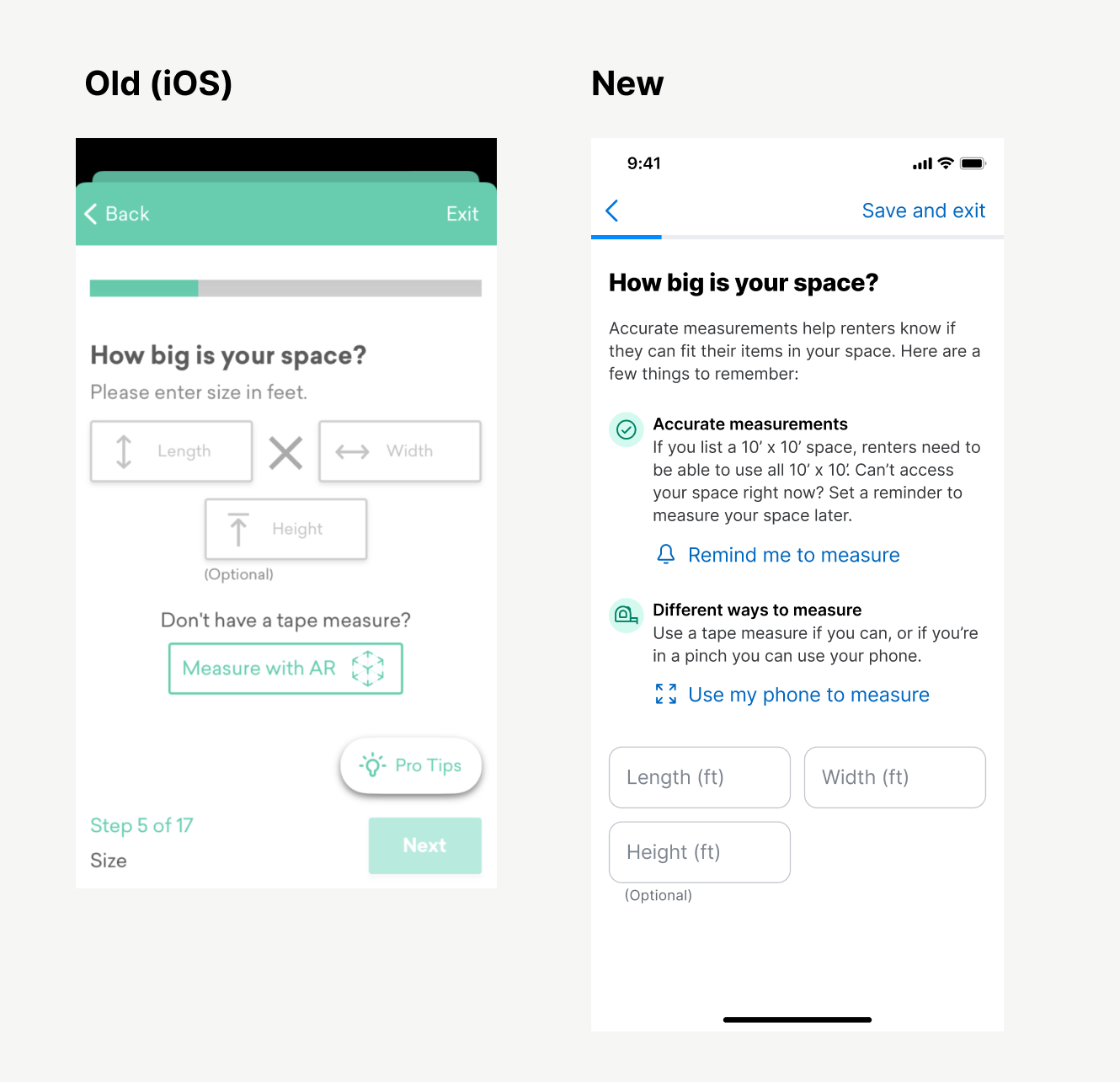
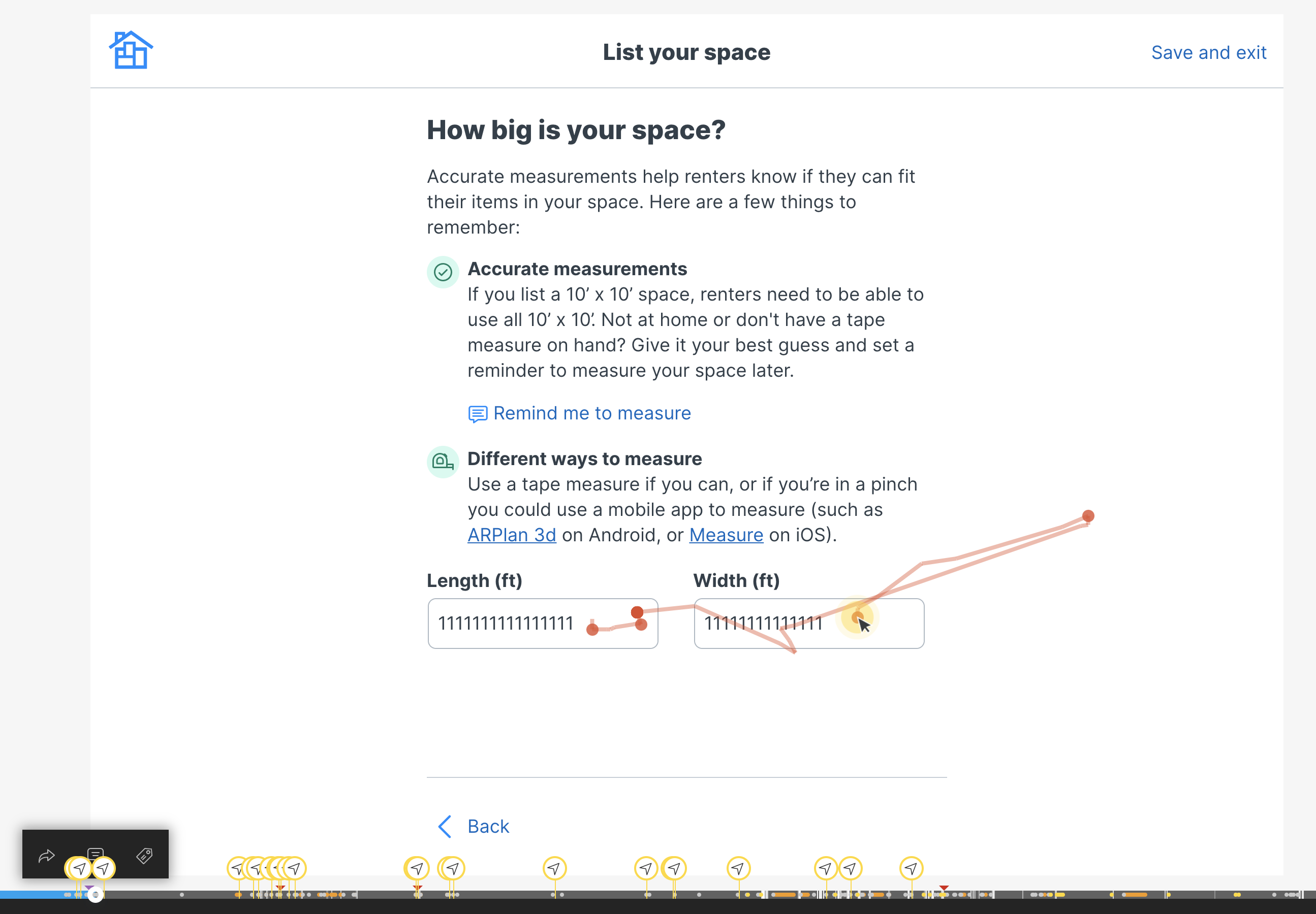
Dimensions: Not only was the UI of this screen a little noisy, we also heard lots of questions from hosts. “Can I guess?” “Does it have to be perfect?” “Do I measure in feet?” This new design answers those questions.
{: .image-container }
Design validation
Prototype testing
Ran two participants through a prototype of the experience, and:
- Found some some language that didn’t make sense (don’t say “Text me a reminder” without saying what the reminder is for)
- Any time you add a
Skipoption, make sure you explain what you explain what you’re skipping. - Explain the benefits of any big, emotional step (like ID verification. One tester asked, “Will this show up on my profile or something?”)
Release Plan
QA Testing
Neighbor doesn’t have a dedicated QA team, so I did a lot of that on my own.
- Downloaded an Android emulator to test the latest Android APKs on my Mac.
- Tested each TestFlight release of the flow for the iOS app.
- Tested each release of the flow on our staging website.
- Received a very prestigious award for submitting the most bugs to our backlog (meaning I got a gift card for finding a lot of bugs)
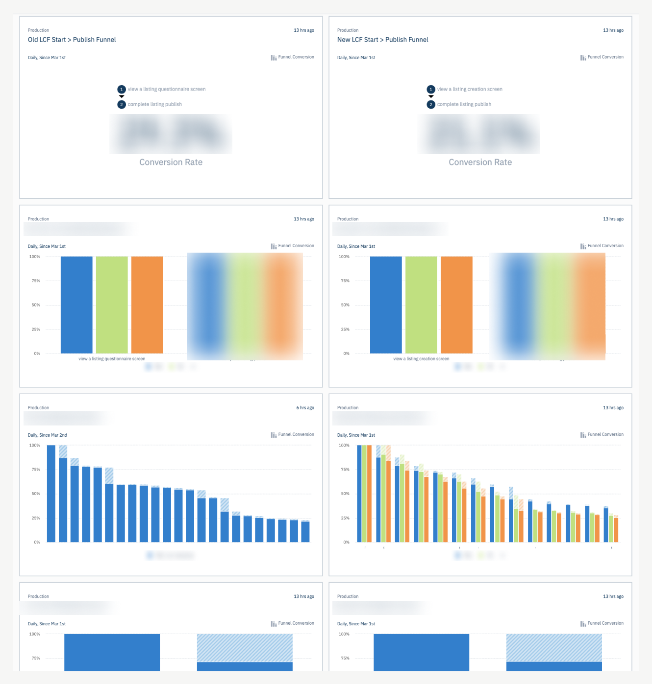
A/B testing
We released the new flow as a 50/50 A/B test. I built several damage control dashboards in our analytics tool (Amplitude) to make sure users were getting through.
{: .image-container }
Session monitoring
I also watched several dozen recorded sessions (Hotjar) to make sure the experience was performing well. (Ignore the 1111111 here, it’s how Hotjar protects user privacy).
We found a few weird button placements due to responsive screen sizing (which we promptly fixed). Everything else is performing well.
{: .image-container }
Usability Testing
I recruited three testing participants. My main takeaways at the time of testing.
- I don’t spot any severe usability issues with the flow (two bugs logged in ClickUp). Each tester moved pretty quickly and wasn’t limited by the UI presented to them.
- Comprehension seems good. Each person casually read the questions and simply answered them. Very few comments like, “What does this actually mean?” or “What happens if I do this?”
- These testers don’t actually have the emotional burden of making their property available for strangers. I think if the new LCF underperforms, it is likely due to this reason.
{: .image-container }
Early outcomes (still investigating)
- The flow decreased the number of listing published (which may seem bad on the surface, but…)
{: .image-container }
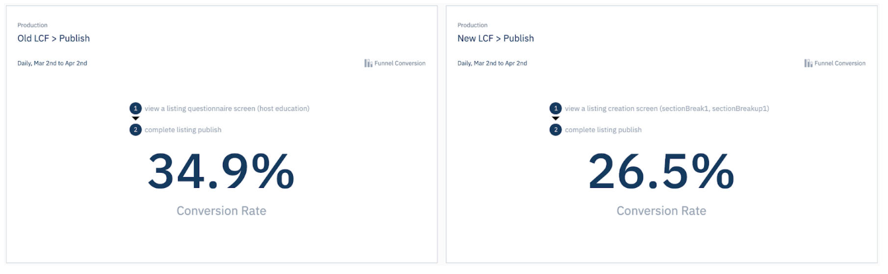
- The listings published through the new flow are 26% more likely to be reserved (a metric used a proxy for the education of the host and the quality of the listing—it’s the most important thing we can measure)
{: .image-container }
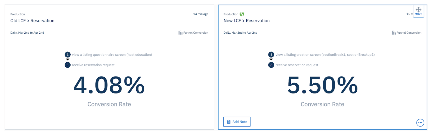
At first it was believe the new flow was losing heavily (34% vs 26%). However, it was discovered our analytics service was over-reporting the success of the old flow. We’re still working on correcting some of this.
The new flow is more verbose and takes a median of 2 minutes longer (10:20 vs 13:30). We’re okay with this as it results in higher quality listings and more educated hosts.
Lessons learned
- Marketplaces are built on trust. So much of this experience lives and dies on the quality and trustworthiness of the content the hosts post on our site (and their trust in us as a company).
- Documentation, documentation, documentation. Because of the size of this project, I knew we would forget half the decisions we made the next. I made a huge Notion document outlining decisions for each step in the flow and why we made those decisions.
- Be ruthless in documenting post-MVP ideas. So many ideas came out from stakeholder feedback, design reviews, user interviews, and other activities and we cut 90% in favor of being agile. We have a rich backlog of ideas to test, try, and implement.
Thanks for reading! 👋